Since 2016, To Do has been part of Streamtime's core product: the drag-and-drop, easy-to-use page integral to the way creative agencies work. It's so beloved that we've barely touched it in ten full years.
Until now.
We've been hard at work on making our new brand live throughout the Streamtime product this year. The seeds were planted with our rebrand work with NB Studio last year (you can read more about that here). Since then, our team has been reworking our design system to match the new brand, across every area and, most importantly, on the page where it all started… To Do.
Honestly, rebranding a whole product with a team of five is a task and a half, and it comes at a time when we're also exploring how best to adapt our roles and day-to-day, now that we have additional technology in the mix. With the help of our robot friend (foe? assistant? minion?), every single one of us is able to interrogate, integrate and roll out more rapidly. We'll be publishing more behind-the-scenes chats about how we all work together going forward.
First things first
In the words of The Hitchhiker's Guide to the Galaxy: Don't Panic. We might have rebranded… but one look and you'll see from the get-go that the core functionality of the To Do page, the beloved drag-and-drop, hasn't changed. Our philosophy here was not to reinvent what's working well, but to make the familiar new and fresh.
We've also added functionality and improved the page: you'll be able to filter and sort your Items sidebar, collapse multiple short To Dos into a grouped block, and move blocks easily from one week to the next… and more.
Core to this rework, and to everything we do next, is better accessibility across the board. With our new look and feel, our colour decisions are constantly reviewed against WCAG and APCA standards. New components make better use of keyboard navigation, and the foundational rebuild takes us towards more customisability (watch this space).
And now, the main event
We've been building a more fully featured design system for a little while now (shout-out to Isobel and Jake, who have been instrumental in designing and implementing it, on the design and dev side respectively). Most of this was easy: we already had semantic tokens, reusable components and the foundations to make the switch simple. What needed more thought were some of the decisions that were inherent to the old brand itself.
The To Do you know today has a specific colour order for the Today stack: a key part of the brand. The order was important, and the colours were specifically chosen to work together in a particular way. The design system had this codified; internally, we called it the rainbow.
Our new brand, however? Doesn't work with the same rainbow look and feel. (We tried.)
In fact, back when we were discussing, arguing, riffing and collaborating on colour palettes with NB Studio, we were trying to think of how the new brand would actually translate in the product. Choosing a colour palette that worked as a rainbow as well as throughout the rest of the brand, with its quirky shapes and textures, meant we'd be compromising.
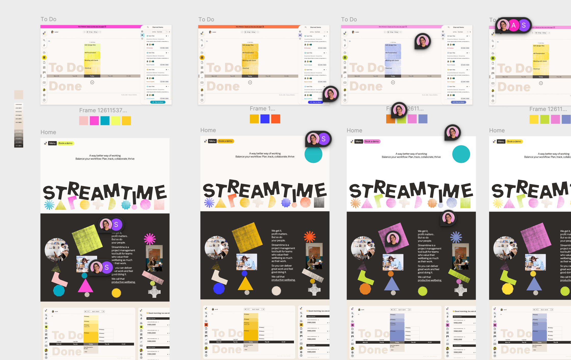
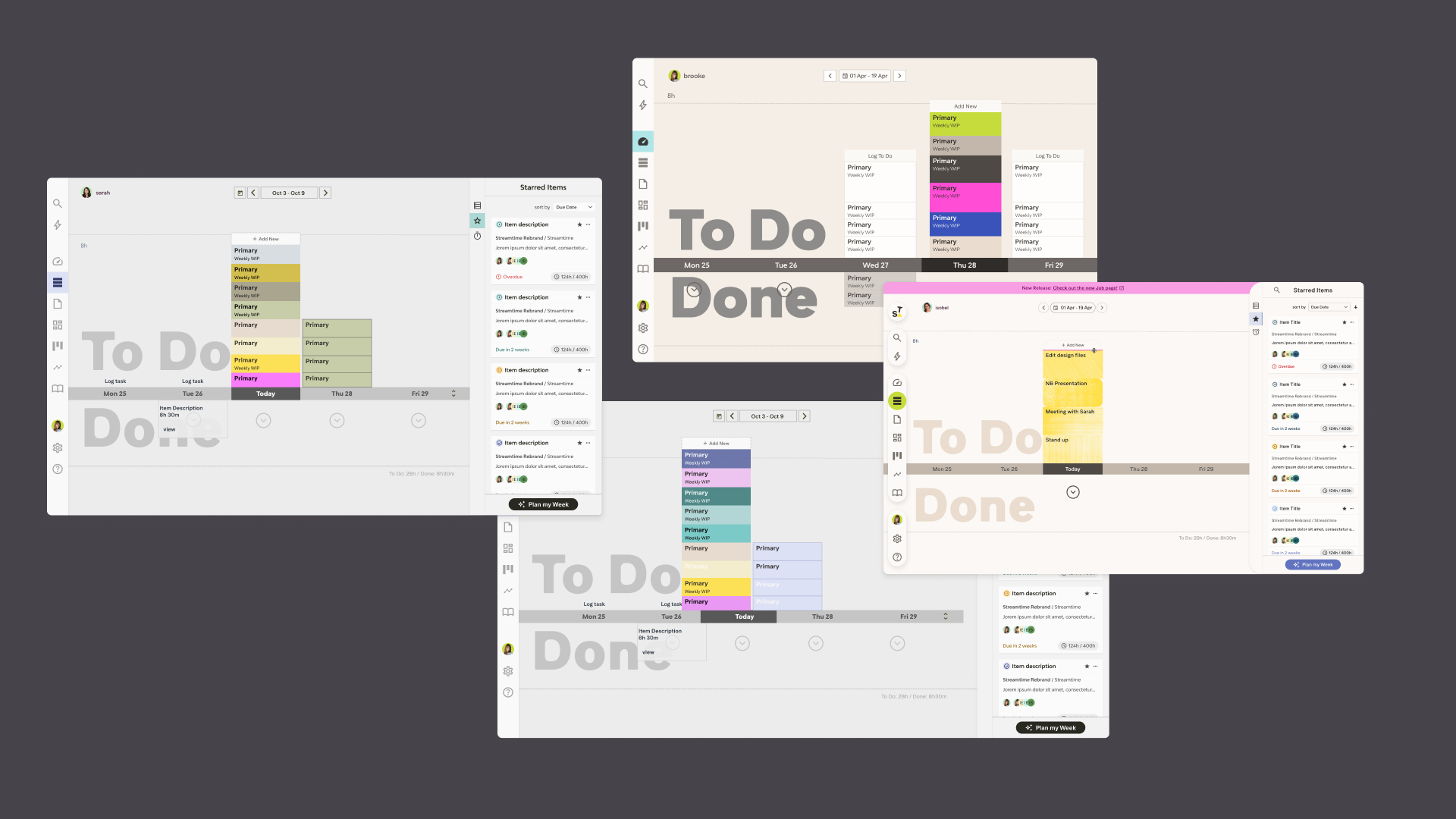
We ended up realising that the tokens themselves needed rethinking. While much of our product could be "reskinned", the core colour decisions, palette and brand language were completely different. The new brand is a fresh look, and we needed to commit. And as much as we loved the rainbow stack, there were also multiple issues that were beginning to keep us up at night, most notably colour contrast: that dark text on the green background was really getting to us.
And so we bid a fond farewell to the rainbow stack, thank it for what it's done for us over the years, and usher in a new era. Rainbows don't last forever, after all.
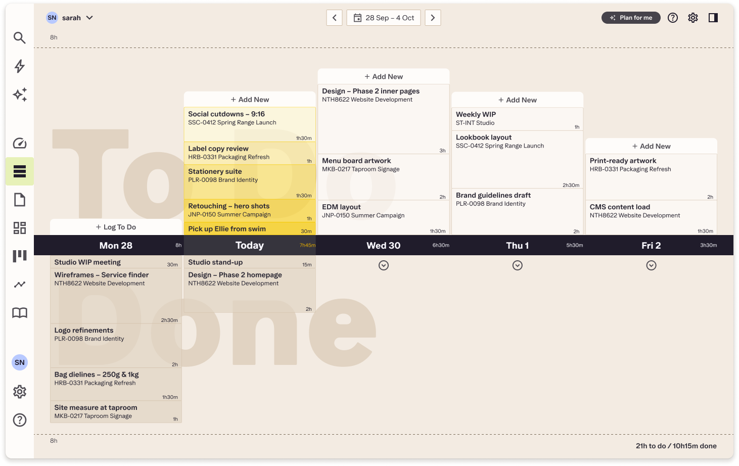
The new To Do sports a warmer base, as does the rest of the product. Moving from a cooler neutral to a warmer one moved us firmly into our new brand, and it's easier on the eyes.
The stack is now a colour ramp of our yellow, which, incidentally, is one of the few colours that survived from the old brand to the new. It's a little nod to our past, if you will. The ramp uses subtle changes to help orient you in the stack, and the overall feeling is quieter, letting you get on with the job. The colour ramp also gives us room to grow… did anyone say dark mode?
Want to know more? We'll be holding a webinar showing off the new To Do in October, and posting more about the process right here. Stay tuned for the registration link in our next newsletter.